Waning Moon by Sico Paints
Another bold hue to liven up your space.
Our editors suggest using this rich, creamy blue in a hallway or office. To keep with the saturated colour trend, paint all your trims. If your ceilings are high, dare to paint those as well. To highlight beautiful architectural details and mouldings, try painting them one shade paler for a truly spectacular look.
Blazer by Farrow & Ball
This fire-engine red will add heat to any room.
Farrow & Ball's Blazer is warmer than any red we've seen in previous years, thanks to its orange undertone. Bright reds have always been popular in dining rooms, as the colour is said to increase one's appetite, but we like to see the colour used as an accent on a chair, a front door or a large, ornate frame.
Cairo by Para Paints
Dare to embrace this season's hottest new colour.
This deep indigo blue by Para Paints is perfect for those looking to inject some darkness into their home without going completely black. For maximum impact, design editor Joel Bray suggests painting all walls and trims in this shade — and for those bold enough, the ceiling too. Try a high-gloss finish for a truly mesmerizing look.
Grape Mist by Sherwin-Williams
A cool colour that pairs nicely with brighter paint picks.
This neutral reads mostly as white, but changes to pale lavender depending on the light. Don't be afraid to cover a whole room this colour, as it won't overwhelm in open-concept spaces.
Light Sandstone by Martha Stewart
A touch of pink makes this colour feminine, but not sweet.
Bolder than peach but softer than orange, Light Sandstone touches on the Honeysuckle trend — without being overly girlie. Wonderfully flattering for a powder room or bedroom. This colour looks trendy when fully embraced.
Metal Illusion by Beauti-Tone
Shades of grey are here to stay.
Metal Illusion is a cool grey that our editors picked to pair with all the blues that we are seeing this year. Layer it with Para Paint's Cairo and Sico Paint's Waning Moon for a cool, denim-inspired look. Keep this shade in a flat finish for an industrial feel that will ground bolder hues.
Olive Moss by Benjamin Moore
Tinted-white trim or accent walls bring this unexpected shade to life.
This muddy-green looks freshest paired with a pale pink or lavender tint rather than a predictable white or cream paint. Try it in vintage-inspired spaces, either as wall colour, upholstery, throw pillows or accent furniture. It's also a great shade to pair with beautiful warm metals.
Prelude by Pittsburgh Paints
This pale blue suits a contemporary decor.
A touch of cyan creates the perfect shade for cool, modern spaces. More lively than white, Prelude follows the blue trend while keeping the space neutral. Try it with grey furniture, especially if you plan on adding indigo to the room.
Soapy Water by Para Paints
Still a designer favourite, warm white remains timeless and versatile.
Soapy Water is a nice option with enough tint to avoid looking like primer. This calming hue was chosen as the ideal white to complement warm neutrals throughout an entire home. Use it to bring more light into small spaces, such as dark hallways or poorly-lit stairwells.
Steel Wool by General Paint
Deep charcoal still dominates in the coming year.
Not quite pure black, this luxurious dark grey is sure to make a strong statement in any room. For a bold look, cover a well-lit room from floor to ceiling, including all trim. Cupboards or accent furniture are the way to go if you want a less dramatic look. Try it in a flat finish where it will read as charcoal, or in a high-gloss on accent furniture for a darker look.
Bright and crisp, Ultra Pure White by BHER is ideal for spaces that exude cleanliness, such as kitchens, bathrooms and laundry rooms. Always fresh, this paint can easily be used on walls, cabinets, mouldings and ceilings.
Hemp by C2 Paints
Livable and classic, this hue will look fresh for years to come.
Hemp was chosen as a warm alternative to Stormy Weather by Olympic. This biscuit hue looks fantastic with all the animal print accents that have made their way into our homes this past year.
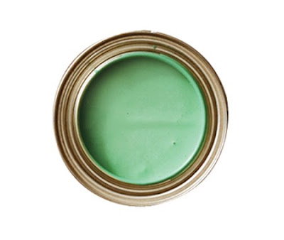
Enchanted Green by Valspar
Light and feminine, this shade complements country decor perfectly.
Softer than some of the other colours on our list, this hue has a touch of blue, lending itself beautifully to a powder room or a bedroom. But where this green truly shines is in a country kitchen. Paired with creamy white cupboards and pale wood floors, Enchanted Green adds a fresh, outdoorsy feel. If painting your walls is out of the question, try putting a coat on a hutch or an island and carry that same colour into your upholstery and drapes.


No comments:
Post a Comment