The Art of displaying
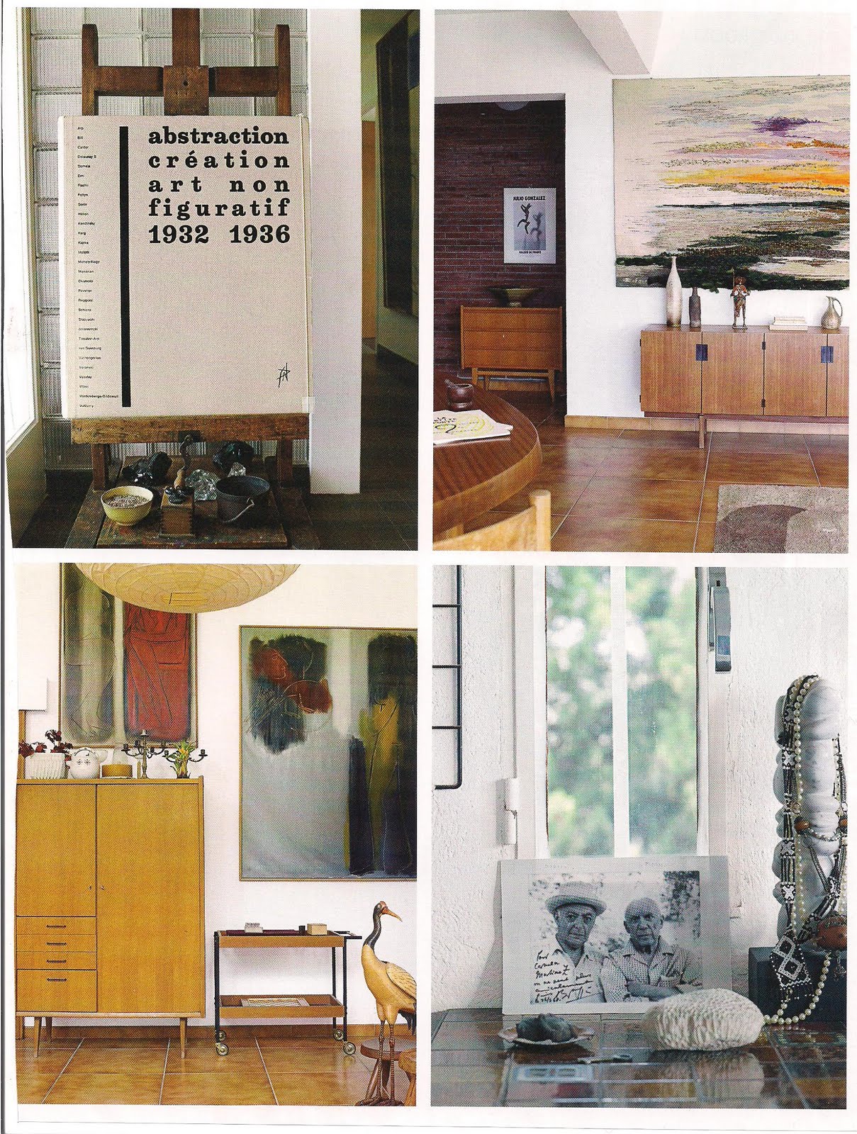
One of the thing that we emphasize at ARTFORM is the way we incorporate Art into our space. Art should play with its surroundings, whether in colour schemes, shapes, forms, and general mood. It can be abstract, or more traditional but it has to be dear to the owner. We prefer displaying Artwork on neutral coloured walls, such as exhibiting Artwork on very dark walls (such as black or dark charcoal grays). It makes the artwork stand out that much more, and it makes the Artwork look like it is exhibited in a museum gallery. Dont forget about the artwork lamp above, this makes the artwork so much more special and brings it to life! The wall colours I tend to recommend is: "Simply White" Benjamin Moore, "Mountain peak white", Benjamin Moore, "Seed Pearl" by Pratt and Lambert, "Off Black" by Farrow and Ball, "Penguin's back" by Sico. No matter what, enjoy it:)
Ideat
Ideat, France
Tommy Smythe
Maureen Bauer
Estylo Nuevo
Thomas O'Brien
Maureen Bower
Ecclectic Revisited


No comments:
Post a Comment