One of the thing that we emphasize at ARTFORM is the way we incorporate Art into our space. Art should play with its surroundings, whether in colour schemes, shapes, forms, and general mood. It can be abstract, or more traditional but it has to be dear to the owner. We prefer displaying Artwork on neutral coloured walls, such as exhibiting Artwork on very dark walls (such as black or dark charcoal grays). It makes the artwork stand out that much more, and it makes the Artwork look like it is exhibited in a museum gallery. Dont forget about the artwork lamp above, this makes the artwork so much more special and brings it to life! The wall colours I tend to recommend is: "Simply White" Benjamin Moore, "Mountain peak white", Benjamin Moore, "Seed Pearl" by Pratt and Lambert, "Off Black" by Farrow and Ball, "Penguin's back" by Sico. No matter what, enjoy it:)
Ideat
Ideat, France
Tommy Smythe
Maureen Bauer
Estylo Nuevo
Thomas O'Brien
Maureen Bower
Ecclectic Revisited
Showing posts with label Display. Show all posts
Sunday, June 12, 2011
Thursday, November 18, 2010
Vignettes
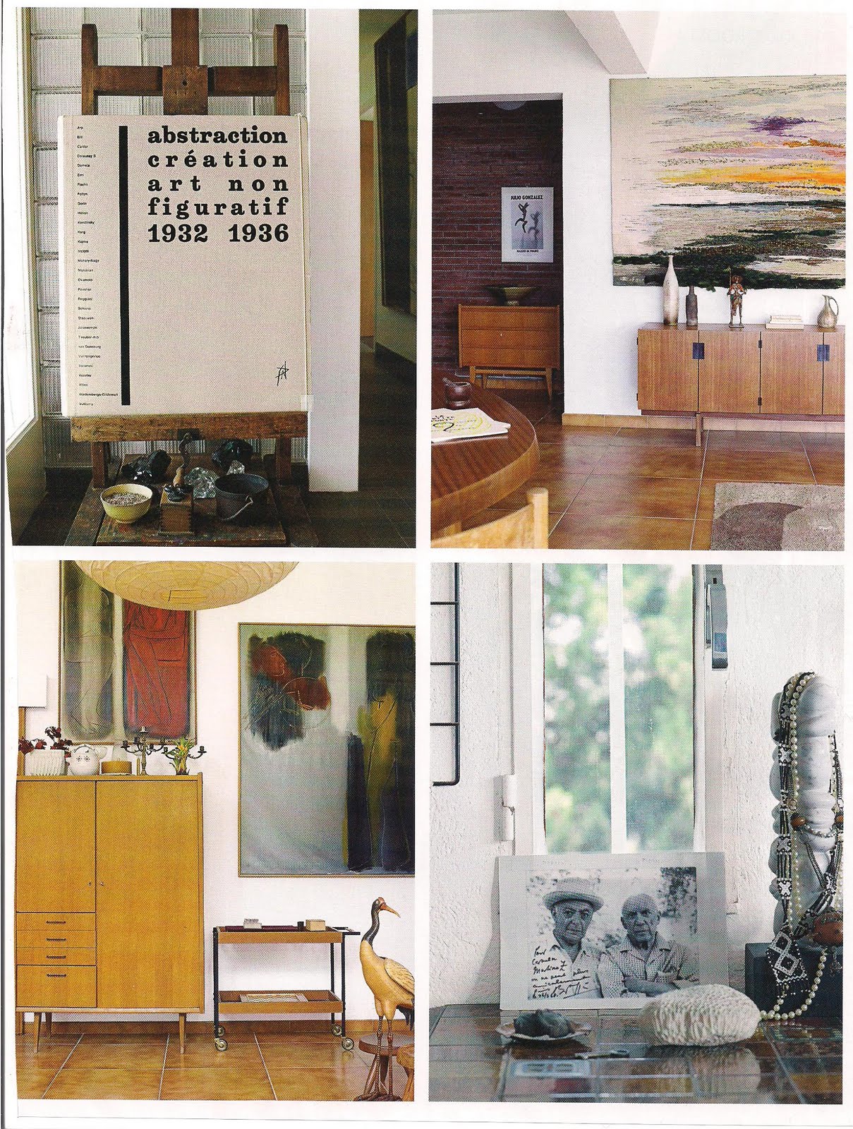
Here are a few vignettes i stumbled upon again wile reading my design blogs (Eye Spy again... )... I absolutely love the impact a vignette can generate. A vignette is considered a focal point in which can be featured an arrangement of artwork, flowers, boxes, light. It has to flow and be connected. One can play with textures, colours, reflective surfaces. The possibilities are endless! I appreciate a well balanced vignette, with substance and character. A vignette can exist anywhere in the house where there is a free space for it. Generally a vignette sports a mirror or artwork above a table/console etc... The older the items displayed, the better it looks!.. here are a few, and then a few of my own!
Jay Jeffers
(La Dolce Vita)
(Chic Coles)
Jay Jeffers
(Katidid)
Jay Jeffers
Subscribe to:
Posts (Atom)